Friday, May 31, 2013

Magazine Reflection

This may be my favorite finished piece I've done. Somehow, over the year, I've come to really enjoy shading. I love the look of this project and I loved all of the values that were in the picture. It wasn't nearly as difficult as I had originally imagined it would be and I even worked on it in my spare time. The hardest part was probably shading the background without making everything black because the scenery was so dark. Drawing the facial features was also kind of hard. I wouldn't have any problem doing a project like this again because it is so easy to get into a groove and have tunnel vision where the only thing in the world is the picture. I guess in the end, Mr. Puffpaff can count it as a victory that I was actually upest when I realized my hand was accidently smudging my picture.

Water Colors

I don't like water colors. I thought that maybe I would like them more after this but I think the hatred just burns deeper now. Don't get me wrong, when done correctly, water colors are beautiful. However, I don't do them correctly. All of my rough drafts turned out better than my final copies and that was a bit irritating. I just could never recreate something and was so worried that I would ruin what I already had. My least favorite fish is the yellow one. I couldn't get the color consistent and nothing really worked out the way I wanted. It ended up being very boring because I couldn't get the right shading. I like the purple fish the best because the shading around the edges came out nicely. Those colors were the ones that I blended the best and I actually do like that picture. I'm indifferent on the tan fish. I think I did too many coats of paint on him in an effort to create some depth. I wanted the colors to be richer and starker but I wasn't able to deepen the brown. Overall, the piece isn't a total failure and I did learn a lot of different watercolor techniques but it's going to be a long time before I consider picking up the paint brush again.

Monday, May 13, 2013

Cartoon Character

This project was okay. I liked painting the background and getting to mix colors again but it just seemed kind of repetetive. It was kind of neat to paint on transparent paper but it was really difficult. You had to paint a lot of coats to make the character not see through. I was most dissapointed with the fact that I drew the person's outline too close together. I would use a smaller pen or make the outline bigger if I could. My favorite part of the piece was probably doing the shading in the cave because I could mess with paint colors again. Overall, this piece really didn't leave an impression on me. I neither loved it or hated it.

Character Skeleton

For my character skeleton, I chose Mable from the show "Gravity Falls". I just love Mable. She was fun to draw, too. I like the soft lines and extreme curves. She was a lot easier to draw than I thought. I liked my rough draft better for both the character and the skeleton but I think that these came out pretty nicely. It was hard to do the skeleton because the proportions were so messed up. The hips were the hardest. It seemed to be a complicated bone. This may be one of my favorite projects yet this year. I like copying things and it was even kind of fun to imagine how the skeleton would be. If I did this again, though, I would just skip the skeleton and make a huge poster of Mable because she awesome.

Letter Mash-Up

I liked drawing the rough draft for this project but it was a pain to paint. There were so many tiny spots that you didn't want to mess up. It was very hard. I liked the outcome a lot, though. Especially the one on the left even though it is upside down here. I also like the concept of two pictures that go together. I wouldn't really change anything if I had to redo this project. I like how it turned out though some of the paints were different shades of black. It also curled up because of the paint. I think this piece is pretty but I wouldn't say it evokes any huge soul searching emotion. Abstract just isn't my thing.

Abstract Letters


Well, for starters, Mr. Puffpaff took the picture upside down. So imagine this right side up. I like the simplicity of this project becuase all you really had to do was paint paper black. On the down side, though, the paint would sometimes dry different colors so you had to be careful to get the same paint jar everyday. It was an easy project but it was frustrating if you accidently got black paint inside the lines. When it was painted, the paper curled, too, which made it hard to rubber cement. It just kept folding up. I also don't really get the point of it. I guess I'm just not cut out for abstract work.

Still Life

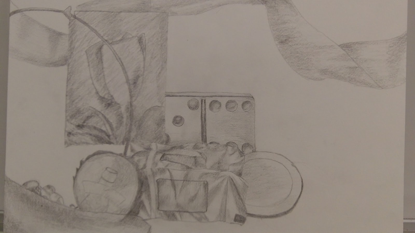
I liked this project once I started shading. It was hard to get the outline just the way that I wanted it though. I liked this piece just because we had a lot of time that we could spend on detail and by the end I had gotten a lot better at shading. I also found that it worked a lot better to use the same pencil day after day because it would get dull and shade better. It was very hard though to set the pieces up the right way everyday and make sure that the light was still hitting the right spots. If I did this again, I would make sure to have a piece of paper under my hand because I noticed halway through that my hand was smudging all of the shading that I had already done. The hardest part was trying to draw the depth of the picture and drawing things behind one another. I would try to change that, too. Overall, I found out that I don't absolutely hate shading quite as much as I thought that I did.

Tuesday, March 26, 2013

Flipbook

http://disney.go.com/create/apps/flipbook

This project was very boring. Very, very, boring. The computer was hard to draw on and very frustrating because everything was so detailed. A lot of time, I would accidentaly do something that I didn't mean to and have to undo it. That took a lot of time. I do like the finished product though. What it comes down to is that I just flat out hate animation. When I was a kid I was always in awe over how animation was made and thought that it looked impossible. Well it is. For the average person anyway. Despite this, the project was a good learning experience. For instance, I learned that I never ever want make cartoons.

Tuesday, January 15, 2013

The Great Doodle Assignment

I hate this project. With a passion, I hate it. And that's not fair because it wasn't the assignment's fault as much as the fact that it was horribly time consuming and I had a lot of homework to do. I still don't like it though. I don't get the point of it. I  don't really think it looks cool and it wasn't very enjoyable. Don't get me wrong, it was easy. But that was the problem, it was too easy. It was mind-numbing. Everything worked about this project. Nothing went wrong. It wasn't a challenge. But I'm being negative. When I was going  over it in fine tip marker, I decided it was quicker to do the big parts in Sharpie and didn't hurt the project but it still used a lot of ink. If I was ever forced to do this again, I would skip doing it in pencil and go right to the fine tip since I didn't make many mistakes the first time. The hardest part was actually going over it again because there was a lot of tiny detail to get right. On the bright side, I learned a few new doodle styles to do in History class!

Clay

Clay is very messy and gets everywhere. However, it is a lot of fun. At first I really didn't like it because I had never done it before but after a while I enjoyed it a lot. I didn't like my mug before I painted it because it looked like something that any five year old could do and I had no idea what I would do with it when I got home. Once I painted it, though, I liked the scene and the penguins and if I'm lucky, my mom will at least use it as winter decor. I had similar feelings on my giraffe-llama. I like how they both turned out though. It took a while to get used to the clay and how to use it but once you learned the methods, it became fun. If I could have a do-over, I would take more time to shape my mug. Smoothing everything out was my favorite part. While the mug was a bit easy, the giraffe-llama was not. I had no idea what to make and I couldn't make any of my ideas. What's the use for it anyway? Finally, I sculpted out an odd looking cross between African Safari and Argentina. Once I painted it, it looked a lot better. The biggest challenge in this project was just letting go of what you had previously learned and giving in to a whole new way of art. Once I did that, it became fun. Besides learning that, I think I learned how to be a bit more creative and confident through these projects. I wish we could do clay all year.

Color Wheel

I was really happy about how this turned out. I was nervous going into it because I wasn't sure if I could do it. In the end, I was really happy with how the colors ended up blending but it took a lot of trial and error to get them right. I actually ended up really liking making the colors and painting. I found that it worked best to get a very tiny amount of my color and a lot of white. I don't think I would change anything about this but given the chance to do it again, I think I could make it better because I've had practice mixing the colors. The hardest part was getting all of the colors to get lighter in the same intervals. So much white paint! It was really neat to learn how to properly use the paintbrush and mix the colors but the coolest thing was that, before this, I really didn't think I liked to paint.

Two-Point Perspective City


I really did not like this assignment. Granted, I made it about a million times more difficult, but still. I just don't care to have enough imagination to design a city. The most successful part of this piece, unfortunately, is not able to be seen. That's because the story behind it is the part that I like best. It's my version of what would happen if the Earth was so polluted that we could no longer be outside. The whole world lives in giant buildings connected by tunnels. Anyway . . . It was not a good idea on my part to make so many horizontal lines. Because it was a two-point perspective  it took forever and a few days. If I were to have to re-do this project, I would scrap most of the horizontal lines. They were not the hardest thing to do, however. The hardest part was determining which point to draw the the lines back to. I wan't very good at determining this so some of the tunnels and building don't look quite right. This was kind of cool to do because I like that there is a set way to do two-point perspective. It's less creative than other pieces. Somehow, though, Mr. Puffpaff found a way to put in just enough creativity that it was hard. I really learned how much I don't like that.

Wednesday, November 28, 2012

Hallway Drawing


This was actually a very fun project once I had an idea. I wanted it to be a bit subdued but still fun. I missed the mark a bit on the whole subdued thing. I would have been much happier with this if I hadn't made the floor so colorful. I attempted to mute the color a little by shading it with black but it didn't have much effect. What I truly needed for the foor was a wheat-like color. Live and learn, I suppose. My favorite part of this piece is the right wall. I had a lot of fun blending the colors even though parts of it ended up being a little cat-pukey. If I could change parts of this I would, as previously stated, change the floors. However, I would also tone down the bench and do more with the trophy case but I didn't have the time for that. The hardest part to this was getting the proportions right, especially with the doors. I wanted them to look uniform but sometimes they would turn out to wide or narrow. The hall divider was also fairly difficult. During this, I just really learned how to get a hand for figuring out proportions. There was no hard and fast method but eventually, you just develope an eye for what looks right (I'm not, however, saying that I have yet attained this!).

Two Point Perspective Name

I am very happy with how this piece turned out but it was a bit complicated. I really like the finished project but I was concerned more than a few times. Since my name is so long, I thought it looked too busy to show the end of every letter. Instead, I choose letters selectively like the "r" in "Munderloh". I also chose a less chaotic color scheme to make the letters easier to read. I wasn't nearly as precise with this drawing as I was with my One Point Perspective Name. I roughly drew out the spaces for the individual letter but I didn't do much measuring from there. If I ever had to re-do this, I would find a way to make more space between the "y" in "Mallory" and the "m" in "Munderloh". They got kind of squished in the end. This actually wasn't as hard as I had first predicted. The hardest part would have to be making space for "Munderloh" but even that wasn't too complicated. I had completely forgotten about two-point perspective before this. I hadn't previously learned about how to take lines back to the vanishing point, and that truly made all of the difference.

Tuesday, November 6, 2012

This was a project? Who would have guessed? It wasn't very hard, just time consuming. This was especially so since I am a perfectionist and had to measure out each letter to make sure that they were straight and symmetrical. I like how this turned out very much. This is pretty much exactly how I pictured it in my head. It worked very well to measure everything. The only problem came when I had to draw the yellow part. I wasn't always sure where each part should end so that it would seem as if it matched up with the other parts. If I re-did this project I wouldn't spend quite as long drawing the letters since they probably didn't need to be that presice. The hardest part of this project was drawing the "m's". There were just so many lines to them! I'm still not 100% pleased with them. Overall, I learned a new technique! The vanishing point was very fun to work with and not something that I would have thought to use otherwise.

Still Life

This was a very intimidating project. When I walked in and saw everything set up, I was desperately hoping that it was for Art Two. I had only one rough draft that looked decent so I decided to draw from that perspective. In the end, I am okay with this piece. As always, I would have liked more time to build up the values more. The project became easier when I really focused on drawing the lines correctly rather than trying to draw the picture as a whole. I learned very quickly that it was necessary to draw every line that I saw. I also have found that I hate the fact that most things are symmetrical. Despite what certain people say, I think that smudging would have been a very good addition to this piece. Though it's hard to see in this photo, the shading on the big pot is very inconsistant and odd looking due to a refection that was present. If I did this again, I wouldn't do it again. It was a very stressful project. I would, however, attempt to make the values that are found in the bottom of the candelabra present throughout the whole project. The candelabra was not, though, the hardest part. The big pot was the hardest part to do because it is symmetrical, big, reflective, and the focal point of the project. In the end though, it was fun to build the values and I think it wouldn't be awful to have to do this kind of shading again.

Monday, November 5, 2012

Super Hero Drawing


I really did not like this art project. It was very complicated and I never felt completely done. I think that this piece is turned out okay but I wish that I had more time or a longer hour. Every time that I got comfortable with drawing, the hour ended. This was also very hard because about halfway through, I found that my action figure was not proportional. This resulted in tiny arms, a huge chest, fat legs, and a small head. I was also very bad at the red shading. I tried to add in purple to make it appear darker, however, it usually just looked splotchy. One of the things that I do like about this drawing, though, is the way that I shaded the yellow. I think that it turned out nicely since I had a gold like color to shade along with the yellow. If I could do this project again, I would simply spend more time on it. I would probably use that time to work on the proportions. The hardest part of this project was definitely the fact that that his arms and legs were white but still had a lot of built up values. I ended up using a creame color along with brown but it wasn't right at all. In the end, I learned to look farther than just what I immediatley saw. When I did that, I could finally see the values so that I could draw them to get more depth in the picture. 


Thursday, September 20, 2012

Pop Can Line Drawing

This went a lot better than I expected. Seeing last year's pop cans made me very nervous to do this project. But in the end, it wasn't nearly as difficult as I had imagined it would be. I think that it was a  successful piece (it better have been considering how long it took me to draw) since I honestly went into the project thinking that I couldn't do it. Once I just started drawing and stopped worrying about it being perfect, I think that my project actually improved. At the start, I kept trying to draw from memory and was focusing too much on the overall picture. That certainly did not work. I started to look at the pop can more frequently and that helped a bit, however, the "breakthrough" was when I was told to just focus on the lines. When I looked at the can as a series of lines, it became much easier to draw. If I was to do this again, I would want to be able to spend more time on it, especially the top of the can. I would also want to do some shading to make it stand out more.The most difficult part of this project was definitely drawing the top of the can and the pull tab. The image was flattened and not a bunch of lines which made it extremely hard to draw. Even with the finished project, I couldn't get the size and shape of the pull tab right. This piece really taught me that I can learn to draw. It seemed impossible at the start, but through baby steps, the piece began to come together and I am very happy with the final result.