This may be my favorite finished piece I've done. Somehow, over the year, I've come to really enjoy shading. I love the look of this project and I loved all of the values that were in the picture. It wasn't nearly as difficult as I had originally imagined it would be and I even worked on it in my spare time. The hardest part was probably shading the background without making everything black because the scenery was so dark. Drawing the facial features was also kind of hard. I wouldn't have any problem doing a project like this again because it is so easy to get into a groove and have tunnel vision where the only thing in the world is the picture. I guess in the end, Mr. Puffpaff can count it as a victory that I was actually upest when I realized my hand was accidently smudging my picture.

I don't like water colors. I thought that maybe I would like them more after this but I think the hatred just burns deeper now. Don't get me wrong, when done correctly, water colors are beautiful. However, I don't do them correctly. All of my rough drafts turned out better than my final copies and that was a bit irritating. I just could never recreate something and was so worried that I would ruin what I already had. My least favorite fish is the yellow one. I couldn't get the color consistent and nothing really worked out the way I wanted. It ended up being very boring because I couldn't get the right shading. I like the purple fish the best because the shading around the edges came out nicely. Those colors were the ones that I blended the best and I actually do like that picture. I'm indifferent on the tan fish. I think I did too many coats of paint on him in an effort to create some depth. I wanted the colors to be richer and starker but I wasn't able to deepen the brown. Overall, the piece isn't a total failure and I did learn a lot of different watercolor techniques but it's going to be a long time before I consider picking up the paint brush again.
This project was okay. I liked painting the background and getting to mix colors again but it just seemed kind of repetetive. It was kind of neat to paint on transparent paper but it was really difficult. You had to paint a lot of coats to make the character not see through. I was most dissapointed with the fact that I drew the person's outline too close together. I would use a smaller pen or make the outline bigger if I could. My favorite part of the piece was probably doing the shading in the cave because I could mess with paint colors again. Overall, this piece really didn't leave an impression on me. I neither loved it or hated it.
For my character skeleton, I chose Mable from the show "Gravity Falls". I just love Mable. She was fun to draw, too. I like the soft lines and extreme curves. She was a lot easier to draw than I thought. I liked my rough draft better for both the character and the skeleton but I think that these came out pretty nicely. It was hard to do the skeleton because the proportions were so messed up. The hips were the hardest. It seemed to be a complicated bone. This may be one of my favorite projects yet this year. I like copying things and it was even kind of fun to imagine how the skeleton would be. If I did this again, though, I would just skip the skeleton and make a huge poster of Mable because she awesome.
I liked drawing the rough draft for this project but it was a pain to paint. There were so many tiny spots that you didn't want to mess up. It was very hard. I liked the outcome a lot, though. Especially the one on the left even though it is upside down here. I also like the concept of two pictures that go together. I wouldn't really change anything if I had to redo this project. I like how it turned out though some of the paints were different shades of black. It also curled up because of the paint. I think this piece is pretty but I wouldn't say it evokes any huge soul searching emotion. Abstract just isn't my thing.
Well, for starters, Mr. Puffpaff took the picture upside down. So imagine this right side up. I like the simplicity of this project becuase all you really had to do was paint paper black. On the down side, though, the paint would sometimes dry different colors so you had to be careful to get the same paint jar everyday. It was an easy project but it was frustrating if you accidently got black paint inside the lines. When it was painted, the paper curled, too, which made it hard to rubber cement. It just kept folding up. I also don't really get the point of it. I guess I'm just not cut out for abstract work.
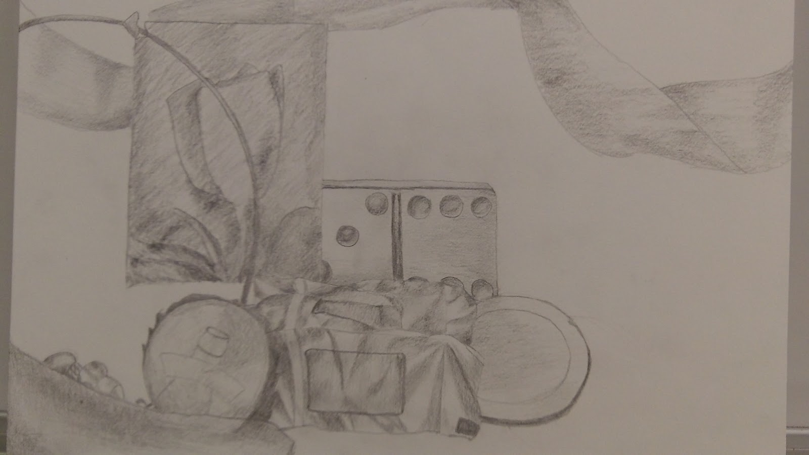
I liked this project once I started shading. It was hard to get the outline just the way that I wanted it though. I liked this piece just because we had a lot of time that we could spend on detail and by the end I had gotten a lot better at shading. I also found that it worked a lot better to use the same pencil day after day because it would get dull and shade better. It was very hard though to set the pieces up the right way everyday and make sure that the light was still hitting the right spots. If I did this again, I would make sure to have a piece of paper under my hand because I noticed halway through that my hand was smudging all of the shading that I had already done. The hardest part was trying to draw the depth of the picture and drawing things behind one another. I would try to change that, too. Overall, I found out that I don't absolutely hate shading quite as much as I thought that I did.